The last few weeks have seen managerial changes at several big clubs around Europe, Moyes coming in at ManU, Mourinho going back to Chelsea, Mazzari taking over at Inter and we could see several more over the summer with PSG, Real Madrid and maybe even Barcelona on the hunt for new managers.
So being the good Samaritan that I am, I’ve created a simple Tableau visualization to help fans and supporters of big European clubs figure out who their next manager should be.
SO WHAT DO ALL THOSE OPTIONS REPRESENT?
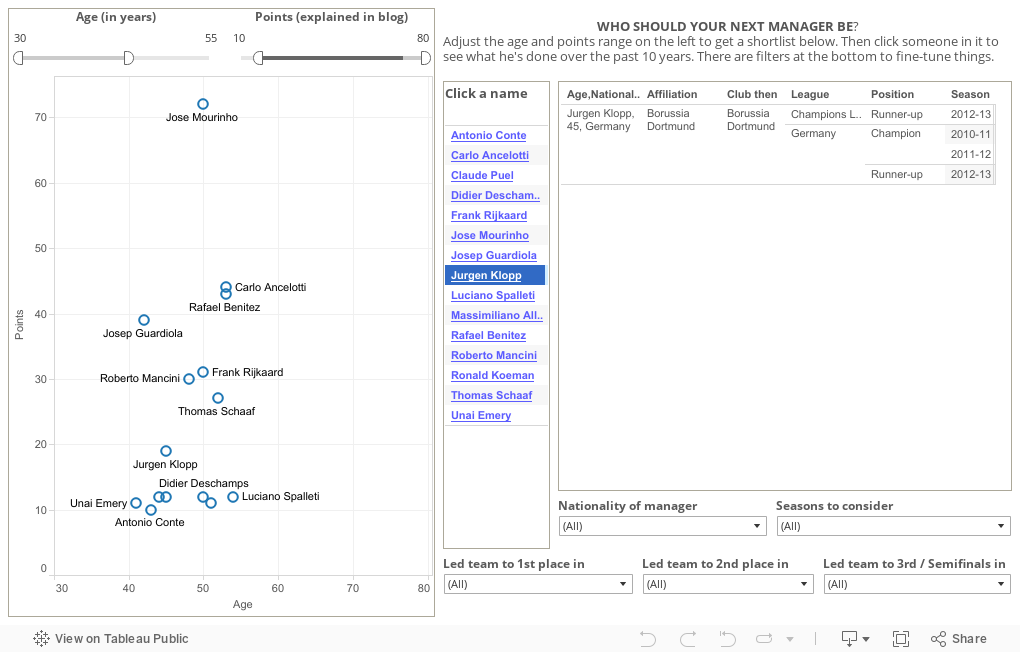
Let me just explain what you see in the data viz a bit. The age filter is pretty self-explanatory, the default is an age range from 35 to 55, you can change that to whatever you want.
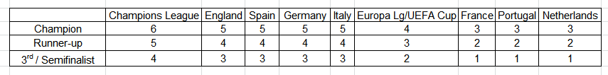
Now for the points range. I’ve awarded points to managers for their achievements over the past 10 years in the “big 7” leagues in Western Europe and UEFA’s Champions and Europa League.
I just added up all those points for those achievements over the past 10 years to come up with a manager’s score. For example, in the default display, Mourinho has a points score of 72, Ancelloti has 53 etc. The graph just plots managers’ scores against their ages. (Didn’t really have anything planned in mind when I did that. I guess one good thing about it is that it adds a visual element to the presentation, otherwise you’re essentially just looking at filtered views of a spreadsheet.)
So you adjust the age and points range filter, and you get a shortlist of managers in the middle. You click on a name there and on the right of the shortlist, you’ll get to see that particular manager’s record for the past 10 years.
And if you want to fine-tune things further, you can use the filters at the bottom to choose managers by nationality or if you want, you can use the “Seasons to consider” filter to only take the managerial record over the past five years into consideration, if you think the default of 10 years goes a little too far back.
With the “Led team to 1st place in” and other filters of its kind, you can deselect certain leagues like the Portugese Primeira Liga if you think winning a title there shouldn’t matter and that managers should only be judged by their achievements in the “bigger” of the big 7 leagues. You would be narrowing your selection pool if you did think that way but ultimately those choices are up to you.
(Also note that they work using the “OR” operator and not “AND”. If that sentence confused you, what I was trying to say was that if, for example, you take the “Led team to 1st place in” dropdown menu and you select France and England, you won’t just get someone who’s won titles in both France AND England like Carlo Ancelotti but also a larger group of managers who have won titles in either France OR England.)
That’s it for my explanation of what all the ‘options’ do for you. After this, I’ll be going a little into how I got all my information and explain some of the choices I've made. It might not make for very interesting reading, so if you’ve read this far and want to move on to other things, I appreciate your taking time out to read my post and hope you have a great day ahead! (Don’t forget to spread/mail/share/facebook/tweet the word about this post too!)
HOW I GOT THE DATA
First off, here’s the link to the complete dataset. Feel free to use it any way you want!
I just looked at the managers who have led their clubs to at least 3rd place in the seven big European leagues or at least the semifinals in the two European club competitions over the past 10 years. I ended up with a list of around 100 managers and using the website
transfermarkt.co.uk. I got the details on their ages, nationalities, present club affiliations etc. and put them all together to get the dataset linked to above. Needless to say I, and not transfermarkt.co.uk, am responsible for any errors that may have crept into it. (There shouldn’t be any though, I re-checked everything as rigorously as I could. But if you find anything wrong, do let me know.)
MY REASONS FOR DOING THIS
I’m an Arsenal supporter and I felt the need to create this data viz primarily to answer the question, “Who should succeed Wenger?”. On the Arsenal-centric
Tuesday Club podcast, according to Alan Davies & co, every time they ask themselves this question, they start off with a huge longlist of managers but eventually always narrow it down to David Moyes. (Guess ManU must have started off with the same longlist too!) I wanted to see what answer I would get after going about this task in a slightly more objective manner.
So if I want someone in the Wenger mould to succeed Arsene, how would I go about it? As a starting point, I would see what Wenger had achieved before he came over to Arsenal and see which present-day managers in their 40s (Wenger was 46 when he was appointed at Arsenal) have achievements that could match those of Wenger. Now in the 10 years before he took over at Arsenal, Wenger had won Ligue 1 with Monaco in 1987-88, was league runner-up in 1991-92, was a runner-up in the European Cup Winners Cup in 1991-92 and reached the semifinals of the European Cup/Champions League in 1989-90 and 1993-94.
So I felt that whichever manager Arsenal goes for next should be expected to demonstrate a similiar pedigree in the big 7 leagues as well as in European competition. That is why I restricted my search to managers who have done well in just those leagues and competitions for the past 10 years. Because of the level of competition, resources and players, these leagues are a cut above the rest and so a manager who does well over there can reasonably be expected to do well in the English first division too. I know, it's a subjective impression but it's one that should stand up to more rigorous analysis. (Would appreciate anyone who has the skills to do that statistical analysis and let me know if it is the case.)
Now this is not to say that whoever matches up with Wenger’s achievements will be “the next Wenger”. A resume tells us nothing about the style with which a manager makes his team play or how great he is in developing players. But it’s a good place to start as we can see which manager fulfills the absolute minimum criteria to be even considered for a shortlist.
TARGET AUDIENCE
So I may have done this for very personal reasons but ideally, fans and supporters of any big club in the seven leagues should benefit from this and get lists of managers they can fantasize over! I’m sure that they’d be using pretty much the same criteria as I did in selecting the next Wenger. But if they want a potential manager to satisfy, at a minimum, a different set of criteria, they can do that too.
SHOULD AGE MATTER?
Ideally, it shouldn’t and if you were offended by my inclusion of an age filter, I sincerely apologize. But let me see if I can at least make you appreciate my point of view. Now, if you want someone to have a long run at your club, you would expect them to be younger. That is an indisputable fact you can’t escape from.
I could be mistaken though in wanting things to be seen from such a long-term viewpoint. Tenures like that of Wenger and Ferguson are anomalies and besides. it wasn’t as if the two of them were granted 15-year contracts at the outset. They got there through a succession of three- or four-year contracts.
By discounting managers who happen to be on the wrong side of 55, I am possibly being ageist to my club's own detriment.
Now that I think about it, I should make a distinction between the question “Who is the next Wenger” (a question where age restrictions probably make sense) and the very different question “Who could I possibly see managing Arsenal next?” (where the age restrictions should be relaxed).
WHAT'S UP WITH THIS POINTS SCHEME?
It is completely arbitrary and subjective, I’ll own up to that. But in the absence of or my inability to create an impartial ranking comparing achievements in different leagues and competitions, a subjective ranking is better than nothing at all. And looking at it, you wouldn’t deny that it might correspond to a large degree to how those achievements might actually rank. (Again, would appreciate anyone who has the skills to do the statistical analysis and let me know how well it does correspond)
And that’s the thing, it’s more a reflection of how, say, leading a team to 3rd place in the Portugese League ranks compared to winning the Champions League rather than how much bigger/smaller an achievement the latter is. To get all jargon-y about it, it’s an ordinal ranking that’s been converted into a crude cardinal score.
(Let me explain. If I were to rank all those achievements in the table above from 1 to 6, getting a 3rd place in the Portugese League would count least for me, so I’ve ranked that as 6 and given a manager who secures that place 1 point. On the other hand, winning the Champions League would be ranked 1st and so I've given a manager who achieves that 6 points. Now the latter may be a greater achievement, we just don’t know how much greater an achievement it is. So it might just be a 5-point difference according to my scheme but it, in reality, could be much larger.)
LIMITATIONS OF THE DATA VIZ
1) It leaves out wins in domestic cups, supercups, club world cups etc. Don’t think they count and just don’t really care about them, sorry! (I know I'm being dismissive about them but when I tried to interrogate myself further on why I thought that way, my internal argument went along the lines of "performances in the cups don't translate into performances in the league or champions league". This means that my disregard for domestic cups is ingrained at such a fundamental level that even when I try to judge their utility, the cups are judged not on their own terms, but in terms of how they affect performances in the two competitions I do care about!)
2) As I mentioned earlier, the data viz tells us nothing about the manager’s style or how well he gets along with everyone (For eg. Mourinho’s excellent resume tells us nothing about how abrasive he is or how destructive he is when it comes to relationships within a club). So all that this visualization tells us is about how the manager looks on paper.
3) Club managers outside the seven domestic leagues are ignored in this. For example, Mircea Lucescu’s trophies with Shakhtar Donetsk in the Ukrainian league are ignored because I don’t think the Ukrainian league is up to the standard of any of the big 7. Because of this, even those managers are penalized who may have made a name for themselves in the big 7 leagues but then moved elsewhere. For example, managers like Luciano Spalleti of Zenit St. Petersburg in Russia or Guus Hiddink of Anzhi Makachkala.
On a side note, I wish I could have included the Russian league. It’s attracting top coaches, players and there’s a lot of money going around, but I doubt how well Russian coaches (like their players) “travel” outside Russia. So I don’t know whether Leonid Slutski, a 42-year-old Russian manager who led CSKA Moscow to the title recently, could do a “job” or do well in Western Europe. Also if there happens to be foreign coaches there, they’re inevitably ones who have made their name in the big leagues. So the names of foreign coaches from Russia will still appear in the results, just that they won’t have done as well under my points scheme.
4) It penalizes managers who may have taken jobs with national teams during this 10 year period. So people like Guus Hiddink and Fabio Capello have suffered.
5) The data viz also disadvantages managers who have had some time off from the game, not because they weren’t getting job offers but because they wanted to spend time with the family or take a ‘sabbatical’ (Guardiola) or were waiting for the right opportunity to come up (Benitez). Genuinely wish there was a way I could un-penalize this group.
6) Another problem is that with all these achievements, you can’t really control for all other factors and separate out what the contribution of the manager actually was. For example, how much was Chelsea’s success in the Champions League down to Di Matteo? I’m reminded of something (I'm guessing?) Guardian journalist Barry Glendenning said on a
football podcast about how Di Matteo then was the equivalent of a teddy bear tied to the front of a runaway train. It could just be that the Chelsea team was that good (or that lucky!) and any manager (other than Villas Boas) could have won them the Champions League.
It also works the other way in that a manager could be really good but because his team isn’t that great, it’ll take time for him to build a name. For eg. Frank De Boer may be a great coach, he’s led Ajax to the third successive title in Holland. But because his Ajax team are never strong enough to compete in Europe, he will never do as well under the points scheme as he could with a bigger team than Ajax.
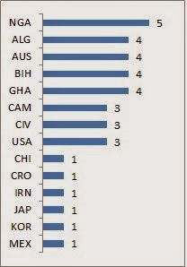
7) You don’t really get much of a diverse nationality pool because of the focus on the big 7 leagues. Now the data viz is about coaches with experience in these leagues rather than citizens of those countries, so you will get people like Pellegrini of Chile or Bielsa of Argentina, but I realize that managers of the country where a league is based will be favoured and get more chances there, and so be represented more. Anyway, below is the nationality breakup. (Also, if you’re English, look away now. But, actually, why should anyone be surprised at how few of them are English managers?)
8) There might be also be a bias towards managers of a certain age. If you’re interested in the age breakup of the managers, it’s here.
In a way it’s understandable because someone younger won’t get the same kind of opportunities to manage a big club, unless they happen to be a prodigy like Andre Villas Boas or unless they happen to be famous players shifting immediately to management like Didier Deschamps did when he managed Monaco. You usually don’t get to jump the rungs like that. Most people have to pay their dues the way Steve Clarke did. He had several jobs, including assistant manager at Chelsea, before he made the move up to manager at West Brom.
Now I was going to say that this bias towards older managers was because of a “recognition lag”. That it takes bigger clubs time to realize how good a manager is and that by the time they do, the manager would have already passed his 40s. The problem with this idea is that it assumes that a manager’s ability level is static and can’t improve with time. The thing is managers do improve with experience and that could be the reason why bigger clubs go for more seasoned managers and this isn't the outcome of some recognition lag.
(
Addendum 2013-06-15: Realized a day after I posted this on my blog, that the ages of the managers in the data viz are their present ages, and not their ages when they were appointed or when they won their trophies in the past. So it's ok for the purposes of this data viz and for its age filter, but it wouldn't be right to make any broader statements on which age groups are shown a bias when it comes to big club appointments, if all I based it on were the present ages of managers. This doesn't mean that all that I've written in the previous two paragraphs is now invalid, but this section is definitely something I will have to review and look into further, possibly in an another post.)
FOOTNOTES
Only go on further if you want to punish yourself!
--If there's a question mark next to a club or country under “present affiliation”, it means that a manager’s position was in doubt at the time of writing and might well have changed by the time you read this.
--The Italian first division title was stripped from Juventus in 2004-05 and as far as I know, wasn't awarded to anyone, so Fabio Capello, the then Juve manger, doesn’t get the credit for it nor does anyone else
--Bobby Robson who got Newcastle to a semifinal place in the UEFA Cup in 2003/04 passed away a few years ago, but I’ve included him just to be complete and for his age, I’ve just put in how old he was at the time of death
--There are some choices I made that seem reasonable to me but are essentially debatable, so thought I should catalogue all of them.
1) In 2005/06. 2006/07 and 2007/08, Netherlands had these silly Champions League playoffs involving teams placed from 2nd to 5th. I'm ignoring them and just taking the positions after the regular season into consideration and the managers who led the teams into those positions, not those whose teams cleared the playoffs
2) This relates to Bayer Leverkusen’s 3rd place finish in the German first division last season (2012/13). They had a kind of a joint coaching arrangement between Sascha Lewandovski and Sami Hyppia but since Lewandovski was given the nominally superior designation of “coach” compared to Hyppia's title “team manager”, I'm giving the credit for the 3rd place finish to Lewandovski.
3) The biggest issue I faced was whom to give the credit for a trophy or a placing in the domestic league, if the club had more than one manager during a season. In some cases, it is pretty clear cut, like there is no way Andre Villas Boas could get the credit for Chelsea’s Champions League win in 2011/12 even though he managed them for the majority of the season and Roberto Di Matteo was only there for the past few months. Ok so technically, he did lead them through the group stages so he should get partial credit for Chelsea’s success. But there’s something unsatisfying about giving the credit for a trophy to two managers. So I’ll give it to Di Matteo because, unquestionably, he played a bigger part in the Champions League win than Villas Boas did.
In other cases though, it’s difficult to figure out so I (a) used my judgment if I have some memory of what went on or (b) just made a call based on how many months the caretaker manager was in charge after the first manager was fired/quit/resigned/moved to another club etc.
Cases where I went with the manager who began the season with the club
• Germany
o 2008/09-Germany-2nd place-Bayern Munich: Given credit to Jurgen Klinnsman and not then-caretaker manager Jupp Heynckes
o 2010/11-Germany-3rd place –Bayern Munich: Given it to Louis Van Gaal and not interim manager Andries Jonker
o 2010/11-Champions League-3rd place-Schalke: Given it to Felix Magath and not caretaker manager Ralf Rangnick. Magath took them to the quarterfinals, Rangnick just won the quarterfinal against Inter before losing badly to ManU in the semifinals
o 2007/08-Germany-3rd place-Schalke: Given it to Mirko Slomka and not caretaker manager Michael Buskens
• Italy
o 2008/09-Italy-2nd place-Juventus: Given it to Claudio Ranieri and not caretaker manager Ciro Ferrara who just came in for the last two matches of that season
• Netherlands
o 2004/05-Netherlands-2nd place-Ajax Amsterdam: Given it to Ronald Koeman (even though he left in Feb 2005) and not to interim manager Danny Blind
o 2011/12-Netherlands-3rd place-PSV Eindhoven: Given it to Fred Rutten and not Philip Cocu
Cases where I went with the manager who ended the season with the club
• England
o 2008/09-England-3rd place-Chelsea & 2008/09-Champions League-3rd place-Chelsea: Given it to Guus Hiddink and not Luiz Felipe Scolari
o 2011/12-Champions League-1st place-Chelsea: Given it to Roberto Di Matteo and not Andre Villas Boas
• Portugal
o 2004/05-Portugal-2nd place-Porto: Given it to caretaker manager Jose Couceiro who was appointed in February and not Victor Fernandez
o 2010/11-Portugal-3rd place-Sporting Lisbon: Given it to caretaker manager Jose Couceiro and not the first manager of the season Paulo Sergio
o 2011/12-Portugal-3rd place-Sporting Lisbon: Given it to caretaker Sa Pinto and not previous manager Domingos Paciencia
SHOUT OUTS
And lastly, I want to thank everyone who may have retweeted my link to this post. I don't have many followers, so it’s difficult for me to get the word out without shamelessly spamming Guardian comment sections or begging more influential tweeters for retweets. So thanks again everyone!