
Monday, June 11, 2012
On the Guardian homepage!
Ok, maybe not the Guardian's homepage but have gotten on to Guardian football's homepage where they've listed my post on pre-tournament odds as one of their favourite/favorite things this week. Visual proof below!

Big thank you to Sean Ingle ( @seaningle ) the sports editor of Guardian online (and their resident betting aficionado!) for putting me on there. Has definitely made my day!
Goals & Assists for 2011-12
The interactive dashboard below helps you explore the 2011-12 season data for goals and assists of players from clubs in the first divisions of 8 leagues - England, Spain, Germany, Italy, Russia, Portugal , Holland, France.
This includes goals and assists for those clubs in all the domestic (Leagues, Cups, Supercups) and European (Champions & Europa League) competitions the clubs were involved in.
You can filter the data by league by ticking or unticking boxes, and you can also build custom lists and compare your favourite players and clubs using the two search boxes.
Imscouting.com, which is where I got the data from, doesn't give you the number of appearances each player made but they do note how many minutes they played. So I used that data to see how effective players were in scoring goals and making assists in a 90-minute period, which would be the duration of a typical match.
The default setting for minutes played in 2011-12 season is at 1000 min. , you might want to lower or raise that.
As mentioned before, all of this data has been obtained from the imscouting.com website.
Notes
----Have not taken the Club World Cup into account, which is why Messi is at 71 and not 73 goals in my dashboard.
-----Have taken some justifiable liberties, such as restricting players to a single club. So if like the Austrian player, Marc Janko, you transferred from Twente to Porto, only your current affiliation is listed.
---Do note that imscouting's data regarding assists is different from the opta stats used by whoscored.com etc. For eg. Fabregas is at 18 assists according to Opta but he's at 13 according to Imscouting.
Dtd: 2012-05-27 twitter.com/ultimateposeur ultimateposeur@gmail.com
This includes goals and assists for those clubs in all the domestic (Leagues, Cups, Supercups) and European (Champions & Europa League) competitions the clubs were involved in.
You can filter the data by league by ticking or unticking boxes, and you can also build custom lists and compare your favourite players and clubs using the two search boxes.
Imscouting.com, which is where I got the data from, doesn't give you the number of appearances each player made but they do note how many minutes they played. So I used that data to see how effective players were in scoring goals and making assists in a 90-minute period, which would be the duration of a typical match.
The default setting for minutes played in 2011-12 season is at 1000 min. , you might want to lower or raise that.
As mentioned before, all of this data has been obtained from the imscouting.com website.
----Have not taken the Club World Cup into account, which is why Messi is at 71 and not 73 goals in my dashboard.
-----Have taken some justifiable liberties, such as restricting players to a single club. So if like the Austrian player, Marc Janko, you transferred from Twente to Porto, only your current affiliation is listed.
---Do note that imscouting's data regarding assists is different from the opta stats used by whoscored.com etc. For eg. Fabregas is at 18 assists according to Opta but he's at 13 according to Imscouting.
Dtd: 2012-05-27 twitter.com/ultimateposeur ultimateposeur@gmail.com
Wednesday, June 6, 2012
How far behind the champions were Arsenal under Wenger?
Had created a graphic a month back comparing Arsenal's performances under Wenger to the champions of each Premier league season.Kept on hearing that this has been arsenal's worst season from all the pundits, so I wanted to see what measure would truly tell us what has been arsenal's worst season.
So what you'll see from the graphic below is the number of points we were behind the title winners each season (the figures in white font with the red bars) and also a truer comparison, the line chart above the bar chart, our points as a percentage or the winning points total. So even if were 12 points behind in both 2004-05 and 2010-11, you can see that, on a percentage basis, we did worse in 2010-11 (85 per cent of winner's total compared to 87.5 % in 2004-05).
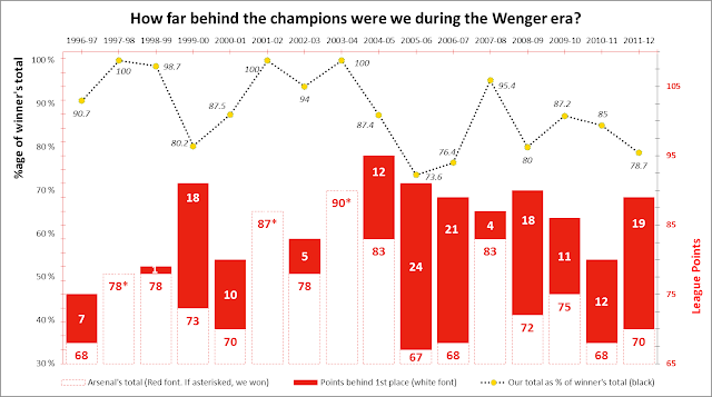
The surprising thing from this graph is that in terms of percentages and absolute points, 2005-06 was our worst ever season. We were 24 points behind and we were at the lowest percentage of 73.6 . (In case, you're wondering, in the season that's just gotten over, 2011-12, the percentage was 78.5, which is the 3rd worst.) Of course, some of you might rightly point out that Arsenal got to the champions league final that year, so that year can't really be termed our worst. And you might be right. In terms of premier league points though, you can't deny it.
twitter.com/ultimateposeur ultimateposeur@gmail.com
Tuesday, June 5, 2012
Odds & Performances
Everyone’s already come out with their Euro 2012 visualization, so just wanted to put mine out before the tournament starts. (Shout out to two other visualizations/dashboards I liked - here and here .)
Now the moment the draw is made for the finals of any major football/soccer tournament, there’s always a newspaper article that comes out talking about what the odds are for various teams to win the whole tournament. These odds change over the months before the tournament starts and I wanted to catalogue what the odds were in the week before the tournament, specifically for the 16 countries competing in Euro 2012.
This dashboard is my attempt to catalogue tournament-eve odds from the British bookmaker Ladbrokes for the past nine major tournaments, going back all the way to USA’94!
(Why didn’t I go back any further? Because before then you still have countries like the undivided USSR & Yugoslavia competing, and that raises lots of issues for what I was attempting to do, for example, whether past Soviet performances should be seen as part of Russia’s record or Ukraine’s. This is just a simple data-exploration dashboard and I really didn’t want to overcomplicate matters, so 1994 it is.)
Needless to say, trying to get the odds data was a pain but, I think, what I’ve managed to get -- while sticking to free sources -- should conform to the records that paid services like betbase and mabel’s tables have. (Also, since you ask, the main source for most of my data was the site thefreelibrary.com which hosts old issues going back to 1998 of the British betting news periodical “The Racing Post”.) Do note that the odds data I used wasn’t exact-moment-before-the-tournament-starts odds but some-time-in-the-week-before-the-tournament-starts odds.
(You will note that I’ve used decimal odds instead of the original fractional odds form of the data. Decimal odds are just more easily recognized by graphing applications.)
Now to the actual dashboard. There are three separate charts in it.
The chart in the top left corner plots the tournament-eve decimal odds for various countries against their performances in a specific tournament. (Choose a year from the drop-down menu.) The top axis lists the various stages a country can reach in either the World Cup or the European Championships while the vertical axis lists the decimal odds in reverse.
As for what you can learn from the graph, a rule of thumb is that if you see colored dots representing countries in the top left of that particular graph, those countries have underperformed while dots that appear in the bottom right of that graph represent overperformance by a country against the odds.
Similarly, the dashboard in the bottom left corner plots the tournament-eve decimal odds for a specific country in various tournaments. (Choose a country from the drop-down menu.)
The third and last chart plots the odds for a country(s) over several tournaments. This chart was done partly as a concession to the fact that you can’t really see what the exact odds for a country at a specific tournament are from the other two charts. Hopefully, this third chart will make up for that.
Other notes and caveats:
--If you want the original data just send a mail to the address listed below and I’ll forward it to you. If you’re looking to use it in a semi-professional or professional context though, you might be better off paying for the actual data from one of those above-mentioned firms that archive historical betting data.
--The axes resize as you choose different countries and years, just keep that in mind, when you’re choosing different options from the drop down menu. It isn’t really a like-for-like visual comparison. (Resizing axes does make it easier to view the data though.)
--Line breaks in the line chart when choosing particular countries represent periods when they hadn’t qualified for any major competition.
--This is elementary but I guess I do have to mention it. The years in two of the charts have the initials WC and EU next to them, for eg. 1994-WC. WC stands for World Cup while EU stands for European Championship.
--And finally, if you want to know what the latest odds are for Euro 2012, here’s the page from Ladbrokes
ultimateposeur@gmail.com twitter.com/ultimateposeur
Subscribe to:
Posts (Atom)